Wallpaper guide
Small Powder Room Wallpaper Ideas: 8 Designs to Compare
Choose a wallpaper direction around the mirror, floor and vanity you are keeping, then test the pattern and wall requirements before ordering.
- By
- EstimatorPad Editorial Team
- Published
- October 26, 2026
- Reading time
- 16 min

Find the idea that fits
Start with the room you already have.
A small powder room can carry a pattern that would feel like too much anywhere else in the house. Whether it works rarely comes down to the print alone. The mirror determines how much paper you actually see. Your floor and countertop set how busy the room gets. The bulbs you use at night change what color the paper really is, and the condition of the walls determines whether it stays up.
On this page
- Choose an idea
- 1. Airy botanical on a light ground
- 2. Dark botanical for a deliberately enveloping room
- 3. Vintage-style floral with restrained surroundings
- 4. Stripes for an orderly, tailored room
- 5. Small-scale geometric
- 6. Toile or another restrained illustrative pattern
- 7. A subtle texture-look wallpaper
- 8. Wallpaper above painted paneling or wainscoting
- Compare the options
- Measure and test
- Choose for the room you actually have
- One wall, all walls, or only above paneling?
- Before you order
- Start with samples
- Before buying
- FAQ
1. Airy botanical on a light ground
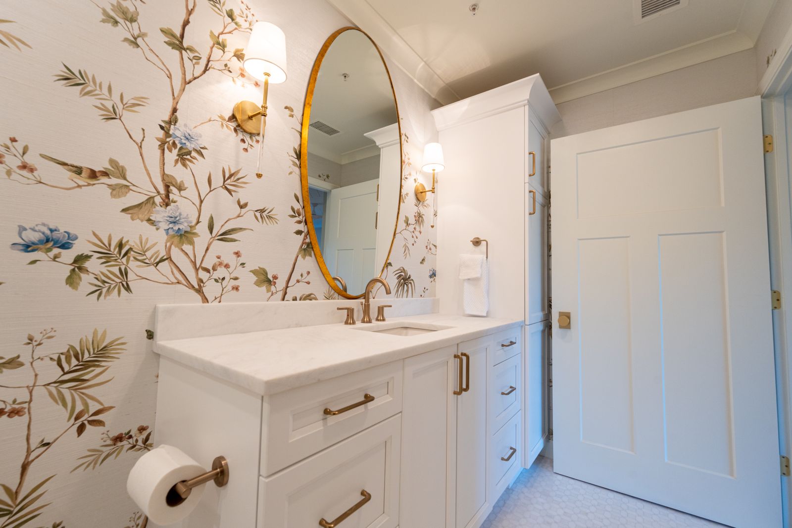
Picture loose branches, ferns or sprigs scattered across cream, pale sage or soft white, with plenty of bare background between motifs. From the doorway the wall reads as a light field with a little life in it. The detail only comes into focus when you're standing at the sink.
This suits a dim or windowless powder room where you want pattern without losing brightness, and anyone keeping white fixtures and painted trim. Pair it with a white or pale vanity, a slim-framed mirror (black or aged brass both stand out against a pale ground), and trim paint borrowed from one of the leaf tones. The open background also gives a busy floor tile some breathing room.
To test it, tape a sample beside the mirror and look at it at night with only the vanity lights on, then with the ceiling light. Pale grounds can drift gray under cool bulbs and yellow under very warm ones.
The catch: low-contrast paper can look washed out beside stark white tile, and light from sconces skimming the wall may emphasize bumps or seams in a smooth, pale surface. If you want the room to feel like an event, go to the next idea.
2. Dark botanical for a deliberately enveloping room

Deep green, ink blue or near-black grounds with lighter foliage turn a powder room into a closed-door surprise. With no window competing, the walls become the whole atmosphere.
It suits a guest-facing room where you want a moody result and will plan the lighting: warm bulbs, sconces at face height, and a pale countertop or white sink so the eye has somewhere bright to land. A mirror with a metallic or light frame will stand out. Painting the door and trim close to the paper's ground color keeps bright trim lines from chopping up the walls. Leaving them white is a crisper, more graphic choice.
Test with a large sample, not a small swatch. Hang it beside the mirror, check your face in it on an evening, then look in from the doorway. Does the light feel flattering, or does the wall swallow it?
Dark doesn't automatically mean cozy. With weak lighting it can feel closed in, and dust, toothpaste flecks or a slightly lifted seam may show against a dark ground. If the room already feels dim and you'd rather brighten it, choose the airy botanical.
3. Vintage-style floral with restrained surroundings
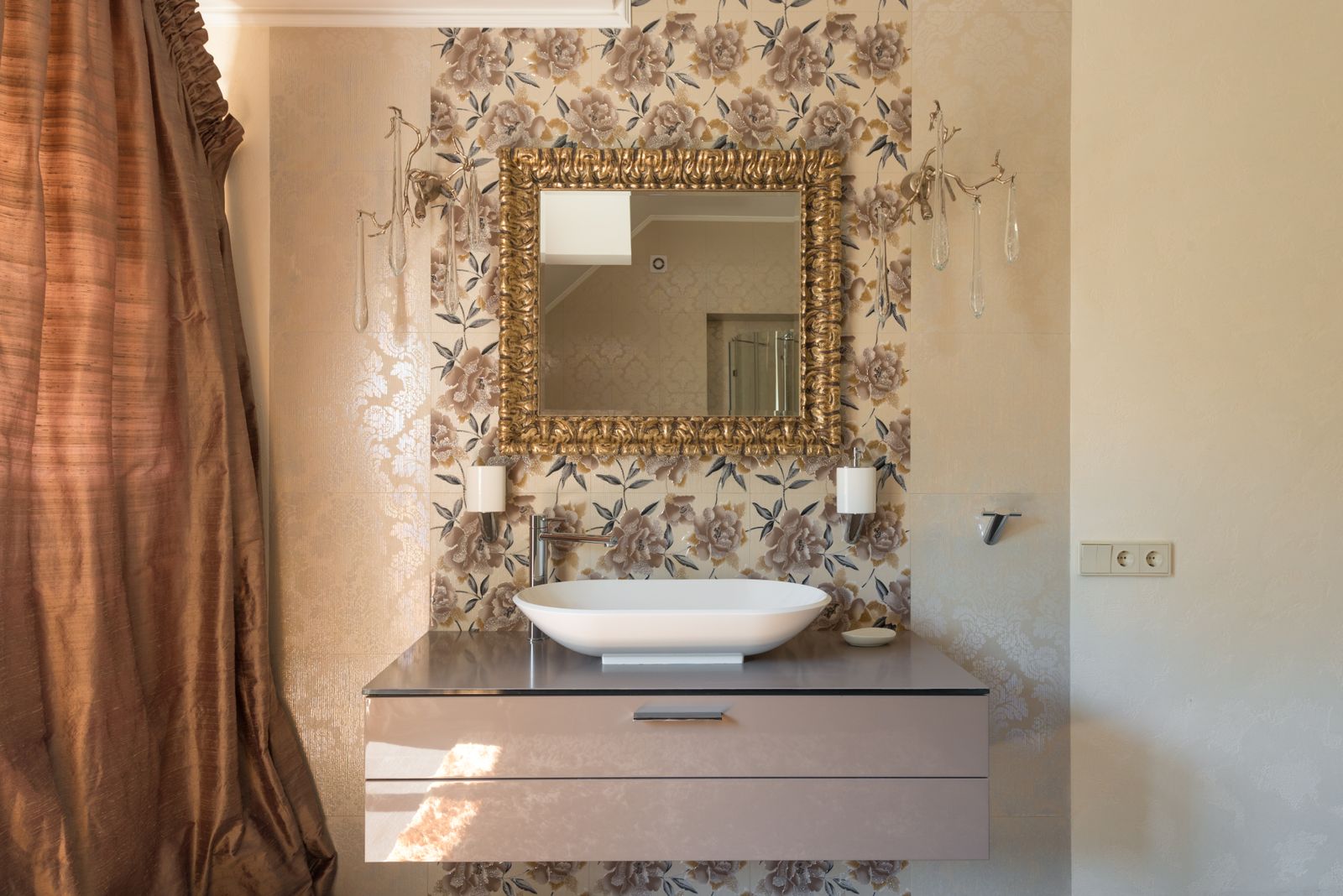
Think larger, illustrated blooms: cabbage roses, chintz-inspired bouquets, flat Arts and Crafts florals, usually in softened or dusty colors. Unlike the airy botanical, the flowers are the main event, so everything else should step back.
This fits an older house or a room that keeps a pedestal sink or traditional fixtures. Pair it with plain painted trim, a simple round or arched mirror, a plain white or small-tile floor, and hardware that matches what's already there. Pull one flower color into the door or ceiling instead of adding a second pattern.
Because the motifs are big, test what stays visible. A swatch usually shows only a fragment, so find the product's repeat height and motif size. Then mark the mirror and sconce positions with painter's tape and work out which blooms survive.
The drawback is that large blooms get sliced by narrow wall sections, sconces and the mirror, and a bigger repeat can require more paper to match. If fixtures cut up your walls, choose a smaller scale.
Advertisement
4. Stripes for an orderly, tailored room
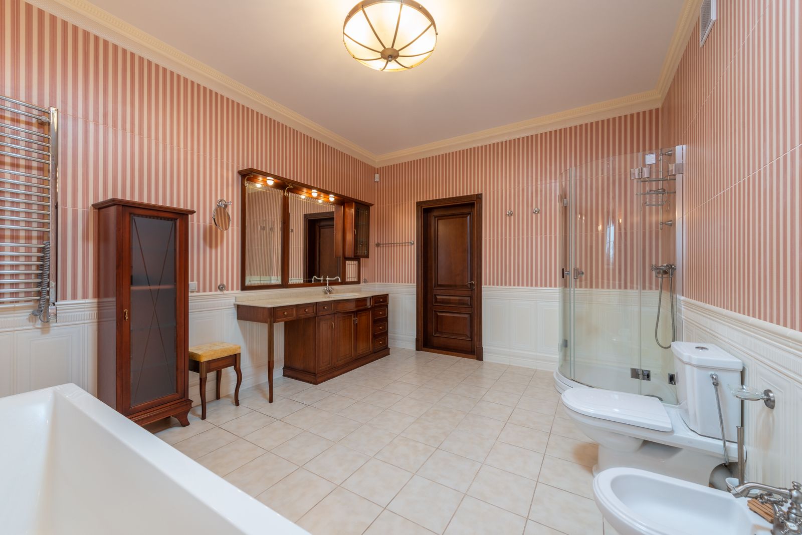
Narrow tonal stripes read as quiet texture. Wide, high-contrast awning stripes read as graphic. Either way, the verticals give the eye something regular to follow, which can steady a room full of fixtures.
Stripes suit walls with reasonably square corners and a level ceiling. A round or arched mirror softens all those straight lines, and a plain vanity keeps the wall in charge. Be careful beside a checkerboard or busy cement-look floor: two strong geometries compete, so make one of them quiet.
Test two ways. Tape a long sample strip beside the door trim, then run a level down each corner to see how far the walls lean. Tempaper's guide recommends marking a fresh plumb line at every corner, which suggests how much the lines can drift.
The drawback is that stripes announce crooked corners, uneven ceilings and seams that wander off plumb. If your walls aren't straight, or you're not confident with a level, a texture-look paper or an all-over pattern forgives more.
5. Small-scale geometric

Think tight trellis, mini diamonds, small medallions or dots. From the doorway the wall reads as texture with a rhythm. At the sink, the geometry comes into focus.
This is a good fit for a room cut up by switches, sconces, a window return or narrow wall sections, where a big motif would be sliced anyway. Pair it with a solid-color vanity and a mirror with real presence, since a thin frame can disappear into a fine pattern. Painting the ceiling or door in the paper's main color helps too. If your floor is also small-scale, like a hex mosaic, the two can sit in the same fussy register, so vary their character.
Test from the doorway and at the mirror. The mirror repeats the opposite wall, so fine, high-contrast patterns can double into visual noise. A phone photo from the doorway helps: if it looks like a flat blur, it will read quietly; if it seems to vibrate, look for lower contrast.
The drawback is that fine lines make any seam misalignment obvious. If you want romance rather than rhythm, look at the florals.
6. Toile or another restrained illustrative pattern
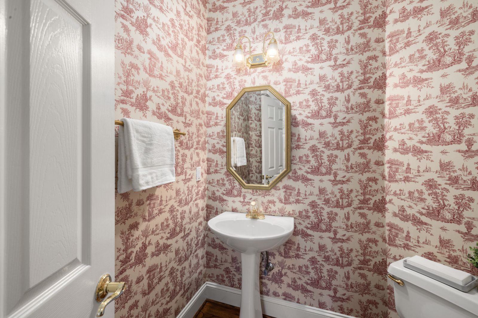
Toile traditionally means a single-color drawing (pastoral scenes, birds, figures) on a pale ground. Modern illustrative papers apply the same idea to landscapes, animals or garden scenes. "Restrained" here means one ink color and lots of open ground. From the doorway it reads as soft tonal texture. Up close, it's a story.
It suits traditional or transitional rooms and anyone who wants narrative detail without a riot of color. Echo the ink color elsewhere: trim, hardware in a matching undertone, or a vanity painted that color (only if its finish takes paint well). A warm wood vanity pairs better with a warm-leaning ink. Keep the floor plain and the mirror framed.
To test it, tape the mirror outline and mark fixtures on the product's full-repeat image. A figure or animal clipped by a mirror edge is far more noticeable than half a leaf.
The drawback is that scenic repeats tend to be larger, so a big mirror can hide most of the story, and a strongly period look commits the room to one style. If there's little uninterrupted wall, choose texture or a small geometric.
Advertisement
7. A subtle texture-look wallpaper

Faux grasscloth, linen-look, plaster-look and pebbled weaves give you a calm wall with depth rather than a pattern to read. The key is how the texture is made. Printed or embossed texture on vinyl, non-woven or peel-and-stick paper is a manufactured surface, and moisture performance depends on the specific product. Authentic grasscloth is woven natural fiber and has different moisture and cleaning limits. Confirm the exact product permits your intended location; a room without a shower still has a sink splash zone.
Texture-look paper suits a room where a busy floor or a strong mirror needs a quiet backdrop. Warm wood, brass and a plain stone or white countertop all sit comfortably against it.
To test it, hold a sample at a raking angle beside the sconces, since sheen and texture change dramatically from straight on. If the care instructions allow a damp cloth, try exactly that on a spare corner. Skip this for natural fiber.
The drawback is that texture-look reads as background, not statement. Natural grasscloth shows its seams by design and may not match between dye lots. A mottled surface may tolerate small wall flaws better than a plain one, but it won't hide real texture or damage, and peel-and-stick makers still want smooth walls.
8. Wallpaper above painted paneling or wainscoting
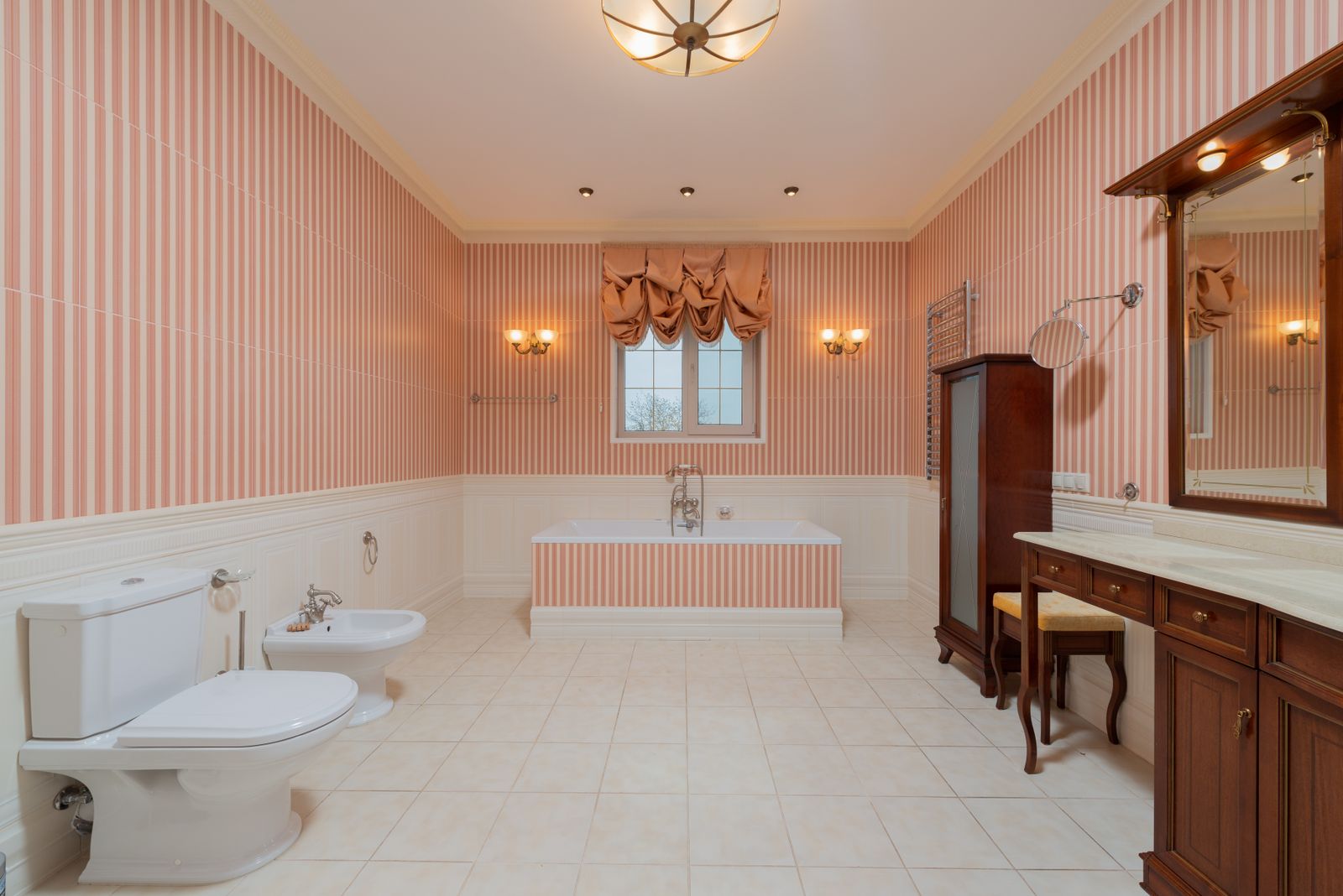
This is a wall treatment, not a pattern, and it changes the room's balance more than any print choice. The lower wall becomes a separately specified paneling-and-paint system; its material and coating still need to suit the sink area. The paper moves up to where the mirror, sconces and eye line are. What's left visible is the band between the rail and ceiling, minus whatever the mirror covers.
Choose the rail height from the fixtures and the pattern you want to show. Tape two possible lines, add the mirror outline, and compare the amount of visible paper before planning the carpentry.
Paint the paneling a color from the paper, in a finish the label recommends for bathrooms. Set the mirror's bottom edge clearly above the rail or aligned with it, because a near-miss looks accidental. A solid lower wall also calms a busy floor, and it's practical if the room sees wet hands.
Test with the tape line and a taped sample above it. Stand in the doorway and ask how much pattern actually shows around the mirror and above the toilet tank.
The drawback is that you're adding carpentry, caulk and paint to a paper project, and paneling projects from the wall, which matters beside door casings. The rail also cuts the room horizontally. For an uninterrupted pattern, paper all the walls. Resolve the wallpaper's termination at the cap with the installer, following the paper and paneling instructions.
Compare the eight directions
| Design direction | Best starting conditions | What to pair it with | Main caution |
|---|---|---|---|
| Airy botanical | Dim or windowless room; white fixtures staying | Slim-framed mirror, pale vanity, trim painted from a leaf tone | Can look washed out against stark white tile; judge at night |
| Dark botanical | Guest-facing room with a real lighting plan | Warm bulbs, face-height sconces, light countertop, metallic or pale frame | Weak lighting makes it feel closed in; dust and seam gaps show |
| Vintage floral | Older home or traditional fixtures | Plain trim, simple mirror, calm floor, one print color repeated | Big blooms get cut by mirror, sconces and narrow walls |
| Stripes | Square corners and a level ceiling | Round or arched mirror, quiet vanity and floor | Crooked walls and drifting seams show |
| Small-scale geometric | Room with many interruptions | Solid vanity, substantial frame, ceiling in the paper's main color | Fine, high-contrast lines can look noisy in mirror reflections |
| Toile or illustrative | Traditional or transitional style | Ink color echoed in trim or vanity, classic hardware | Scenes get clipped by the mirror; strongly period look |
| Texture-look | Busy floor or counter needing a calm backdrop | Warm wood, brass, plain countertop | Natural grasscloth risks water marks; printed versions vary by product |
| Above paneling | Splash-prone lower wall; pattern wanted up high | Painted paneling in a paper color; mirror aligned to the rail | Added carpentry and paint; much less paper visible |
Measurement steps
How to measure
- Measure each wall width and height in more than one place; mark every door, window and fixture.
- Tape the mirror outline over a full-repeat pattern image to see which motifs remain visible.
- Compare samples beside the retained vanity, floor and counter under the actual evening lighting.
- Record roll width, usable length, repeat and match type; use the manufacturer’s strip-based ordering method.
- Check surface, paint finish, cure and moisture requirements for the exact paper before buying.

Advertisement
Choose for the room you actually have
A windowless powder room. Daylight never rescues or betrays the paper, so only your bulbs matter. Judge samples at night under the actual bulbs. Both light and dark can work, and the real risk is a mid-tone paper under a dim fixture. Check the room's ventilation and the wallpaper maker's moisture restrictions; a windowless room needs a plan for both light and moisture.
Existing busy flooring or countertop. Let the busy surface star and choose the quietest paper: an airy botanical with lots of open ground, a texture-look, or paper above plain paneling. If you love a bold print anyway, borrow one color from the floor rather than matching its scale. Avoid putting two fine-scale patterns side by side.
A large mirror and little exposed wall. Most of the paper will live at the edges and above the glass. Favor patterns that read in fragments (stripes, small geometrics, texture, scattered botanicals) over scenes with focal figures. Papering all the walls lets the mirror frame the pattern, but remember it also reflects the wall behind you. Tape the mirror outline on a sample before choosing.
Textured or damaged walls. Fix the wall before choosing the paper. Tempaper doesn't recommend its peel-and-stick on textured surfaces and suggests testing a sample. Ask the manufacturer before assuming a sample test is enough, because a sample that sticks for a week doesn't prove adhesion in a humid room. Paper also won't hide soft drywall or moisture damage. Find and fix the cause first.
A modest refresh where the vanity and floor stay. Treat those finishes as the brief. Hold samples against the countertop, floor tile and grout, and compare undertones. A paper that shares one color with something already in the room looks deliberate. Often a quieter paper plus a new mirror or lighting does more than a bolder print.
One wall, all walls, or only above paneling?
One wall usually reduces the area to cover, although awkward corners and fixtures can still make installation demanding. In a powder room, the wall facing the door is the one guests see first, but behind the vanity much of it is mirror. Stop at an inside corner, not mid-wall, and paint the other walls a color from the paper. In a room this small, a single papered wall can look arbitrary.
All walls is the most immersive choice. The mirror repeats it, and the eye has no plain wall to escape to. It also means the most seams, corners and matching, and the most to remove later.
Above paneling shows the least paper, can place a suitably specified, cleanable finish below the paper, and adds carpentry. None of these is universally best. Choose by what you can live with and install.
Before you order
These checks cost far less than a wrong roll.
Assess the walls. Look for flaking paint, soft spots, stains, heavy texture and old wallpaper. Sherwin-Williams calls for cleaning off dirt and oils and priming before traditional paper. If you'll prime or repaint first, our paint calculator helps estimate the priming or repainting area separately from the wallpaper order.
Check the product's substrate and moisture requirements. Read the paint finish, cure time and humidity limits for that exact paper. Sherwin-Williams says traditional paper in a room with a bath or shower can be damaged by humidity over time. Tempaper calls its product water-resistant, not waterproof. Cure guidance varies: Tempaper's product page asks for at least four weeks on newly painted walls, while its installation guide says to follow the paint can. If instructions for one product disagree, ask the maker.
Test a sample in the actual room. Put it at the mirror and beside fixtures, and view it at night. For adhesive products, also stick a sample on a hidden patch of the same paint and see how it holds.
Measure every wall. Take the height at several points and the width of each wall. Mark the door, vanity, mirror, sconces, switches and any window. The square footage calculator can record surface areas, but it doesn't count strips or account for pattern matching.
Sketch the layout. York suggests starting in the least visible corner, since the start-and-stop point is the one spot unlikely to match. Decide where seams will fall relative to the faucet, mirror edge and toilet tank, and which part of the pattern lands at eye level.
Check roll width, roll length, repeat and match type. Know whether a listing is a single or double roll, and whether the match is straight or drop. Use the exact product's roll dimensions, repeat and match type in the manufacturer's ordering method; total wall area alone is insufficient.
Confirm ordering method and batch. Tempaper says to make sure all lot numbers match and to give the original lot on a reorder. Some natural-fiber makers say dye lots can't be matched later. Ask about returns before you buy.
Plan the installation. Think through access behind the toilet and around the vanity. Follow the exact paper's trim, adhesive and drying instructions. Have electrical covers and nearby fixtures handled safely rather than cutting around a live fitting.
Why nominal square footage can underestimate the order. Square-footage math treats a roll as one sheet you can cut anywhere. Wallpaper hangs in full-height strips, and only whole strips count. Take a hypothetical roll with 198 usable inches and a wall needing a 99-inch strip: you get two. If matching the pattern pushes each cut to 101 inches, you get one, and the remainder is offcut. These numbers illustrate the mechanics only and aren't from any product. Repeat, match type, roll length and trim allowance all change strips per roll, which is why the manufacturer's calculator beats area math.
Wallpaper order worksheet
| Record | Your room or product | Why it matters |
|---|---|---|
| Wall widths and heights | ___ | Use the tallest measured strip, including the specified trim allowance. |
| Mirror and fixture positions | ___ | Shows which motifs remain visible and where seams can land. |
| Roll width and usable length | ___ | Controls whole strips per roll rather than area alone. |
| Pattern repeat and match | ___ | Changes strip length and matching offcuts. |
| Surface, paint cure and moisture limits | ___ | Confirms suitability before committing to the order. |
| Batch, number of rolls and return terms | ___ | Keeps matching and reorder assumptions explicit. |
Start with samples
Order two or three samples that answer different questions from this guide. Tape them beside the mirror and against the vanity, floor and countertop you're keeping, then look at them at night under your real bulbs. When one wins, read the manufacturer's sheet for that exact product before ordering a single roll. Check the wall surface, paint finish and cure time, moisture limits, repeat and match type, and lot number.
Project checklist
Before you buy or build
- Suitable wall and paint condition confirmed
- Actual repeat tested around the mirror
- Moisture and cleaning limits checked
- Strip yield and matching allowance confirmed
- Batch and return terms recorded
Planning note
Verify before buying or building.
Photographs are visual references, not EstimatorPad projects or verified installations. Confirm the exact product instructions and suitability for your own room before buying; construction, waterproofing and repair details need the appropriate installer.
FAQ
Common questions
01Can I wallpaper a powder room with no window?+
Yes, with some care. Manufacturer cautions focus on humidity and direct water, and Sherwin-Williams steers traditional paper toward guest bathrooms and well-ventilated rooms rather than shower rooms. Check the room’s ventilation, keep paper out of the direct splash zone where you can, and choose a product whose instructions allow bathroom use.
02Peel-and-stick or pasted?+
Peel-and-stick needs no paste and, per Tempaper, can be repositioned while hanging. But it's demanding about walls: smooth, primed, painted in the specified finish and cured. Pasted paper involves more steps (priming, pasting or activating, and drying time) and has its own removal method. Neither is better everywhere. Match the choice to your walls, humidity and patience.
03Will it come off without damaging my walls?+
It isn't guaranteed. Tempaper says its paper removes cleanly, while York notes that sealing the wall matters for later removal and that adding paste to prepasted paper voids its easy-removal guarantee. Results depend on paint quality, cure time, wall condition and how long the paper has been up. If you rent, check your lease and test a hidden patch.
04Does a small room need a small pattern?+
No rule says so. Interruptions matter more than scale. A large pattern can be dramatic where one wall is visible at a time, but a mirror, sconces and narrow wall sections chop it up. Fine patterns can turn busy in reflections. Decide by taping the mirror outline on a sample.
05How do I handle seams around the toilet tank, vanity and mirror?+
Plan before cutting. Have the installer plan access and the seam layout before cutting. Do not remove plumbing fixtures just to reach a seam unless the work is handled appropriately.
06Can I seal wallpaper with a clear coat for moisture?+
Only if both the wallpaper maker and the coating maker support the combination. Sherwin-Williams mentions decorator's varnish as optional extra protection for traditional paper in humid bathrooms, but that's one company's tip, not a rule for every paper. Coatings can change sheen or color, so choose a bathroom-suitable paper instead.