Paint guide
Painted Kitchen Cabinet Ideas: 8 Color Directions
Choose cabinet colors around existing counters, floors and appliances, and settle condition, scope and coating compatibility before starting.
- By
- EstimatorPad Editorial Team
- Published
- October 26, 2026
- Reading time
- 15 min

Find the idea that fits
Start with the room you already have.
Cabinet paint covers more of a kitchen than almost any other finish, yet it rarely gets a blank slate. The countertop, flooring, backsplash and appliances usually stay, and they quietly decide whether a new color looks deliberate or slightly off. A white can turn gray beside cream counters. A green can drift yellow beside honey-toned floors.
On this page
- Choose an idea
- 1. Warm off-white cabinets with warm existing finishes
- 2. A restrained greige or taupe palette
- 3. Muted green cabinets with wood and neutral surfaces
- 4. Deep blue cabinets with a deliberately lighter surrounding palette
- 5. Charcoal or near-black cabinets with controlled contrast
- 6. Lighter uppers and deeper lowers
- 7. A contrasting painted island with quieter perimeter cabinets
- 8. Selectively painted cabinets alongside retained wood
- Compare the options
- Measure and test
- Choose around the finishes that will stay
- Paint everything, the lowers, or just an island?
- Are these cabinets worth repainting?
- Test and plan before buying paint
- Cabinet project planning worksheet
- Your first step
- Before buying
- FAQ
1. Warm off-white cabinets with warm existing finishes
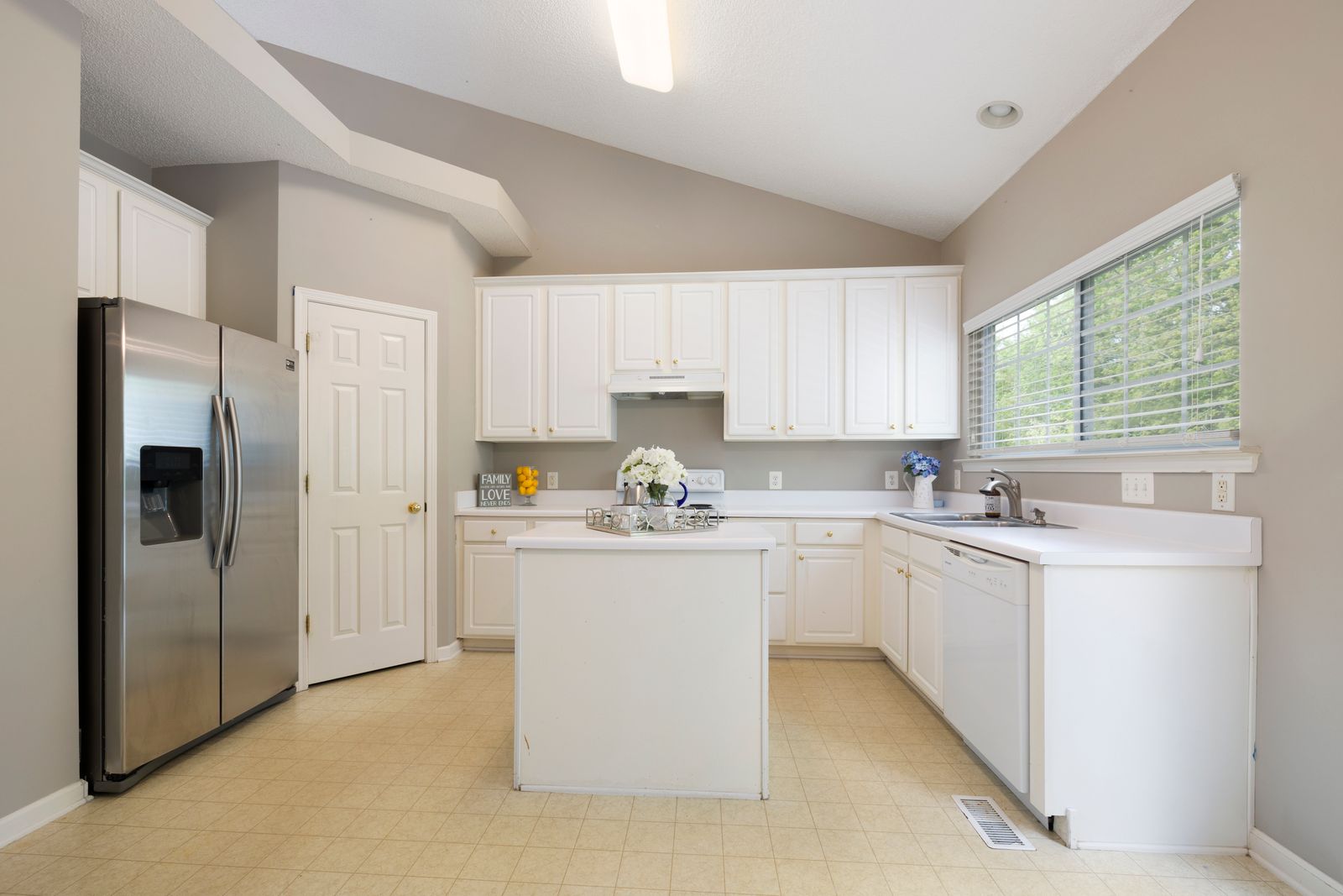
The look. Cream-leaning or softly buttery doors and frames that sit tone-on-tone beside tan, beige or golden surfaces. The room reads layered and gentle rather than high-contrast.
Good starting point. Cream or beige counters, warm wood or wood-look floors, a backsplash with a warm cast.
Suits. A kitchen where the counter is the biggest fixed surface and carries a visible yellow, tan or peach cast.
Test it. Hold a large sample against the counter's vertical front edge, the face you see from across the room. Then slide it toward the nearest white appliance and trim. Check in daylight and again under evening bulbs.
The catch. The risk is two whites that don't match. A cabinet white that looks right on a chip can look gray beside creamier counters or yellow beside a cooler appliance. Coatings also differ on yellowing: Benjamin Moore's Advance data sheet notes slight yellowing can occur, more visibly in light colors and in dark or poorly ventilated rooms. Read the sheet for your product.
2. A restrained greige or taupe palette

The look. A soft gray-beige or taupe, quieter than white and warmer than gray, so the doors recede and the counters and floor lead.
Good starting point. Speckled or busy granite, mid-tone flooring, muted neutral tile. These surfaces already mix warm and cool flecks.
Suits. Someone who wants calm cabinets without committing to a strong color.
Test it. Skip "is it beige or gray?" Hold the sample beside each retained finish and ask whether it looks pinker, greener, yellower or bluer than that finish. Check it at lower-door height beside the floor.
The catch. Small undertone shifts show in greige, and one sample can read beige in one room and gray in another. No single shade goes with everything. If every sample reads as "nothing," a muted green may be a clearer choice.
3. Muted green cabinets with wood and neutral surfaces
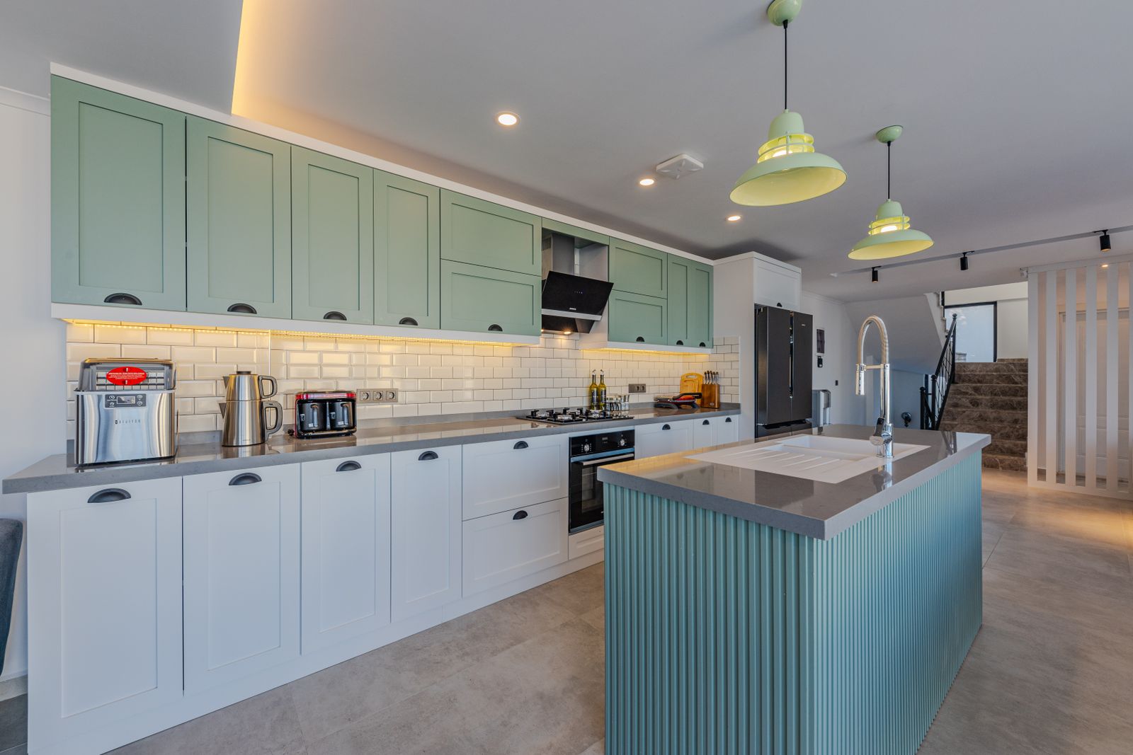
The look. Sage, gray-green or olive-leaning green at moderate depth, natural beside wood rather than bold.
Good starting point. Wood floors, wood trim or open shelves, butcher-block or neutral counters, plain tile.
Suits. A kitchen that wants visible color without going dark.
Test it. Undertone changes everything. Gray-leaning greens tend to sit quietly beside stone. Yellow-leaning greens read warmer and can pull yellow from a honey-toned floor. Blue-leaning greens cool the room and can drift toward teal beside warm counters. Check samples beside the floor and counter edge, then under your evening bulbs.
The catch. A backsplash with its own strong color or pattern gives the green a competitor. In that case, a quieter neutral may serve better.
Advertisement
4. Deep blue cabinets with a deliberately lighter surrounding palette
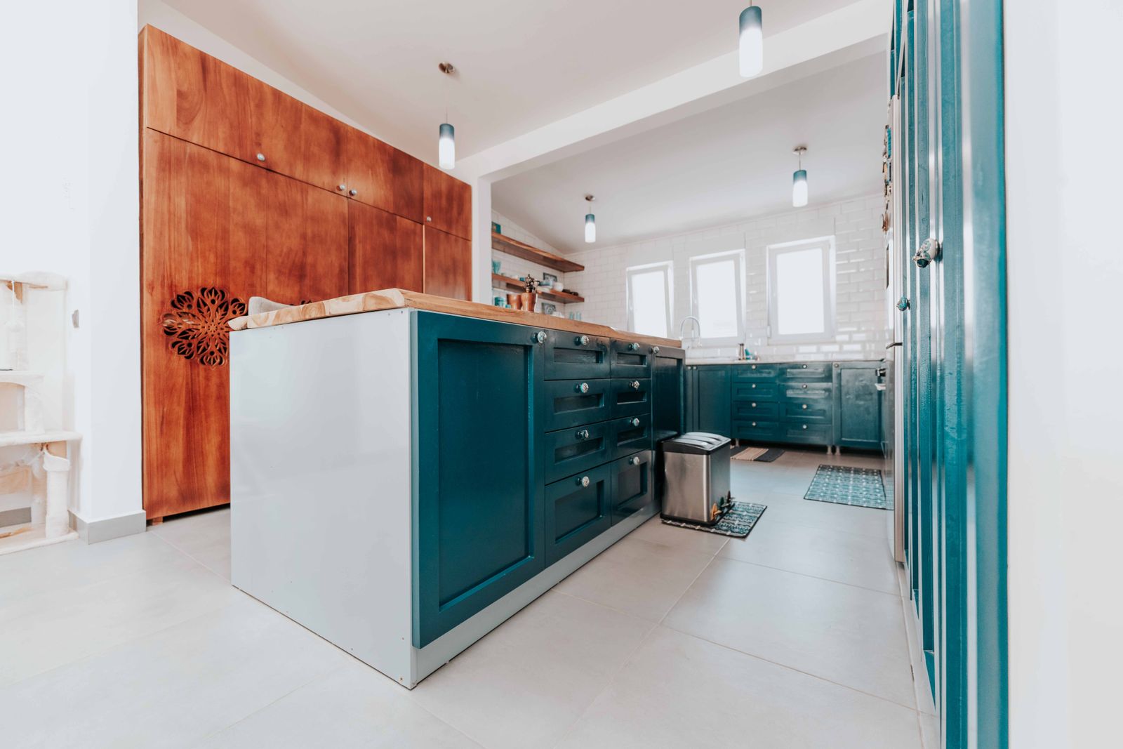
The look. Navy or inky blue cabinets framed by lighter walls, counters and backsplash, so blue is the single saturated element.
Good starting point. Light or low-pattern counters and backsplash, light-to-mid floors, stainless appliances.
Suits. A kitchen with decent daylight that wants depth without added pattern.
Test it. Put a large sample on the biggest cabinet run and view it from the doorway at night. Dark colors absorb light, so the amount you paint and the light you have both matter. A blue that feels rich in a bright kitchen may feel heavy on every cabinet in a dim, compact one. Judge it with your own sample.
The catch. Practicality depends on the product more than the color. Dust, fingerprints and wear can show differently on dark finishes, varying with sheen and coating, so check the maker's cleaning and cure instructions. Big color changes may also need a tinted primer; Benjamin Moore's Advance sheet says so. If your counters and floor are both dark and busy, consider limiting blue to an island (idea 7).
5. Charcoal or near-black cabinets with controlled contrast
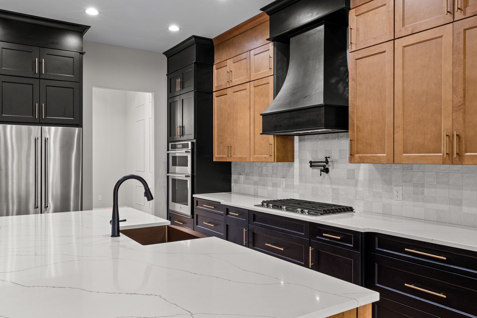
Where the blue direction is color against light surroundings, this one is about line and contrast: door edges, counter edges and hardware become a graphic outline.
Counters. You want a counter edge that reads as a clear line, such as pale stone or light wood. A dark, busy counter beside charcoal tends to blend into one mass.
Hardware. Decide early whether pulls disappear (tone-on-tone) or stand out. An undecided mix looks accidental.
Architecture. Flat or simple shaker-style doors show charcoal as clean planes. Heavily profiled doors add shadows that can look busier and heavier.
Test it. Charcoal can lean blue, brown or green. Compare the sample beside stainless and black appliances in your own light; slightly different blacks and sheens will sit side by side.
The catch. Dark finishes can make brush marks, uneven sheen and dust easier to see, and they can weigh on a compact kitchen. If you want the contrast without painting everything, consider idea 6 or 7.
6. Lighter uppers and deeper lowers
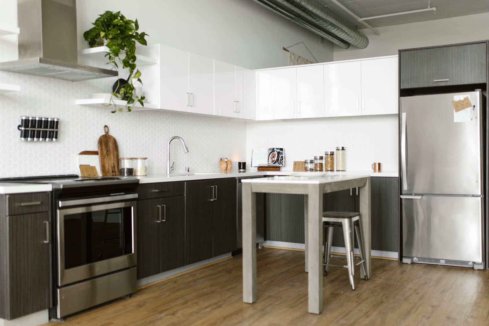
The look. Two-tone kitchen cabinets: a lighter upper run and a deeper lower run, with the counter and backsplash forming the dividing line. Some brands call this a tuxedo kitchen.
Good starting point. Dark, gray or patterned floors that the lower color can echo, or busy counters that benefit from quieter uppers above.
Suits. A kitchen where the uppers form a big visual wall and you want depth without darkening the whole room.
Coherent when the colors share an undertone or one is a deeper version of the other, the counter and backsplash make a clean break, and you set one rule for in-between pieces. Tall pantry cabinets and refrigerator surrounds should follow the lowers, the uppers or the wall, everywhere.
Check for competing colors. Stand in the doorway and compare the floor, counter, uppers, lowers, walls and backsplash together. If the new pairing adds another strong element to an already busy room, test a quieter version. There is no fixed number of colors that makes a kitchen work.
Test it. Tape one upper sample and one lower sample into the same view, including where they meet a tall cabinet.
The catch. More boundaries mean more decisions about end panels, cabinet sides and toe kicks, and two colors can chop up a small room.
Advertisement
7. A contrasting painted island with quieter perimeter cabinets

The look. An island or peninsula in a richer color, with perimeter cabinets left as they are or painted a soft neutral.
Good starting point. An existing island or peninsula, plus a wood or busy-granite perimeter you want to keep.
Suits. Kitchens with a limited work area, or households that need most of the kitchen to stay usable. It can be a contained scope that changes the focal point; the actual workload depends on the island and the other options. If you don't have an island, skip this idea; there's no need to add one.
Test it. View the sample from where the island is seen most, with the perimeter in view. The island top may differ from the perimeter counters, so compare against both.
The catch. A color that fights the perimeter finish you're keeping looks like a mistake. The island's seating-side and back panels also face other rooms, so they are part of the scope.
8. Selectively painted cabinets alongside retained wood
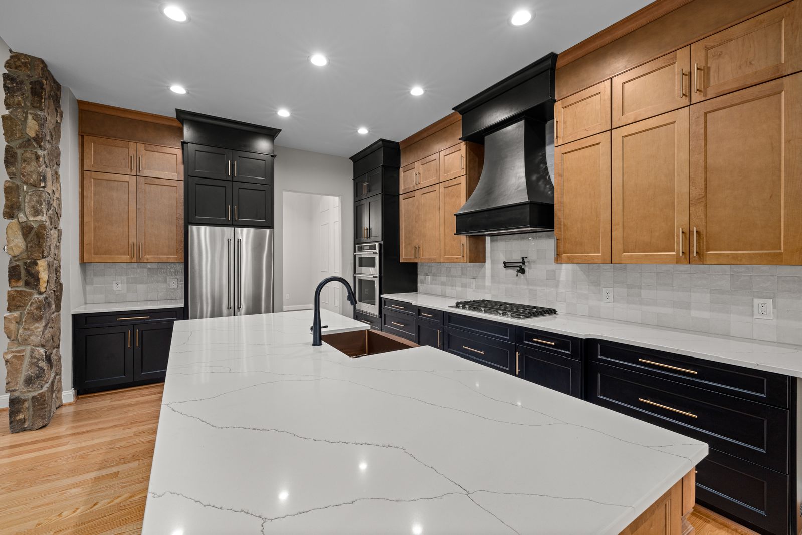
The look. A deliberate split, such as painted uppers over stained lowers, or a painted sink wall beside a stained hutch run, with wood that is chosen to stay.
Good starting point. Wood you like in good condition, with floors or counters whose tones relate to it.
Suits. Homeowners who want less painting and still like their wood.
Intentional or accidental. A deliberate arrangement follows a rule (all uppers, one wall, the island) and breaks at natural stops like corners or tall cabinets. It also accounts for every visible surface: end panels, filler strips, face frames, toe kicks. An accidental one leaves a stained end panel beside a painted door.
Test it. Tape the sample onto a wood door. The same gray-green looks different beside red-toned oak than beside pale maple.
The catch. If the wood is the part you dislike, painting around it can make it more noticeable.
Compare the directions
| Direction | Existing finishes to compare | Best starting situation | Main caution |
|---|---|---|---|
| 1. Warm off-white | Counter front edge, nearest white appliance, trim | Cream or beige counters, warm floors | Mismatched whites |
| 2. Greige or taupe | Granite flecks, floor, backsplash | Mixed warm and cool fixed surfaces | Undertone shifts; can read as plain beige |
| 3. Muted green | Wood floor, trim, counter edge, backsplash color | Wood and neutral surfaces | Yellow versus blue undertone; competing backsplash |
| 4. Deep blue | Counter, backsplash, wall color (all lighter) | Light, calm surroundings and good daylight | Heavy when every cabinet is painted in a dim room |
| 5. Charcoal | Counter edge, hardware, appliance finishes | Simple doors, a clear counter edge | Flaws and sheen differences show |
| 6. Light uppers, deep lowers | Backsplash band, floor, tall cabinets | A clean dividing line at the counter | Too many colors; more boundaries |
| 7. Painted island | Island top, perimeter counter, floor | An existing island, limited work area | Clashes with retained perimeter finish |
| 8. Paint plus wood | Wood tone, painted color, hardware | Wood you like, in good condition | Reads as oversight if surfaces are missed |
Measurement steps
How to measure
- List the counters, floor, backsplash and appliances that will remain.
- Identify a representative door’s material, coating and condition before choosing a paint system.
- Compare large color samples beside the counter edge, floor and appliances in daylight and evening light.
- List every door, drawer front, frame, filler, toe kick and exposed side in the proposed scope.
- Measure the faces being coated and use separate product coverage and coats for primer and topcoat.

Advertisement
Choose around the finishes that will stay
You don't need to replace the counter, floor, appliances or backsplash to make a color work, but you do need to test against them. Material names don't reveal undertones: granite, quartz and laminate each come in many colors, so compare physical samples instead of assuming.
Busy granite. Decide whether the cabinet should pull one quiet tone from the stone or step back with a calmer neutral. Hold large samples beside the slab's edge.
Cream or beige counters. Compare warm off-whites and greiges at the counter edge. A stark white can make cream look yellower by comparison.
Cool gray flooring. Lower doors sit near the floor, so test samples at that height. Cool cabinet colors may feel cohesive; warm ones may contrast on purpose. Make the choice deliberate.
Warm wood floors. Greens and blues change with the wood's red or yellow cast. Also check where a similar-depth cabinet color and floor blur together at the toe kick.
Stainless, white or black appliances. White appliances expose off-white mismatches. Black appliances beside near-black cabinets expose small differences in tone and sheen. Stainless reflects nearby color.
Existing patterned backsplash. Choose a cabinet color that picks up one quiet tone from the pattern, or stays out of its way. Press the sample against the tile. If the backsplash may also change, our kitchen backsplash guide can help you coordinate.
A kitchen with little daylight. Judge samples under your actual bulbs. Very deep colors may feel heavy here, but a lighter color isn't guaranteed to feel brighter. View both.
An open-plan room. Cabinets share sightlines with furniture and flooring beyond the kitchen. Look at samples from the adjoining room, where island backs and pantry sides are visible.
How to compare samples. Use large painted boards or peel-and-stick samples, not screens; paint makers note on-screen colors can differ from the paint. Stand each sample vertically beside the counter's front edge, backsplash, flooring and appliances, then view it in morning, midday and evening light.
Paint everything, the lowers, or just an island?
Scope changes the look, the workload and how many decisions you face before anyone can estimate the job.
Tall cabinets and appliance surrounds interrupt the run. A pantry cabinet or refrigerator surround belongs visually to both uppers and lowers. Decide whether it follows one color or the wall, and apply that choice consistently.
Decide these surfaces before you estimate:
End panels (exposed cabinet sides)
Toe kicks
Filler strips
Exposed face frames
Open shelves
Cabinet interiors that show through glass doors or open shelving
Interiors are optional; Benjamin Moore's furniture guidance, for instance, calls painting drawer interiors optional. Whatever you choose, settle the scope first so everyone is estimating the same job.
| Scope | Visual coherence | Scope of work | Watch for |
|---|---|---|---|
| Everything | Most unified | Largest: every door, drawer front, frame and exposed panel | A clear rule for tall cabinets and appliance surrounds |
| Lowers only | Works when uppers are neutral or open shelving; otherwise can look half-finished | Smaller, but still includes lower frames, end panels, toe kicks | Old finish meeting new color at corners |
| Island only | One focal point; perimeter unchanged | Often contained; access depends on the workspace and coating schedule | Island relating to the perimeter; panels facing other rooms |
| Painted plus retained wood | Intentional when the split follows a rule | Varies | Unfinished leftovers reading as oversights |
Are these cabinets worth repainting?
Paint renews a finish. It cannot make a failing surface sound, repair damaged material or fix a poor layout.
A sound cabinet needing a refresh. Doors hang and close squarely, frames are solid, and the finish is intact and wipes clean. Dated color or a worn finish is what paint is for.
Loose hardware or sagging doors. Repair stripped screw holes, loose hinges and misaligned doors first.
Damaged or swollen substrate. Bulging edges near the sink or dishwasher, soft spots and crumbling board are material problems. Paint won't restore them.
Peeling or failing surface layers. A new coating holds only as well as the layer beneath. Benjamin Moore's Advance sheet says to remove peeling paint and feather the edges. A lifting laminate or vinyl layer is a different problem and may mean repair or replacement of that front.
An unknown coating or material. Look at a door's back, a hinge cutout or a chipped corner, bring a door to a paint retailer or cabinet professional, and test a hidden spot. A guess isn't a basis for buying primer.
A layout problem. If the real issue is too little storage, a cramped aisle or a badly placed range, color won't solve it.
Know which surface you have:
Solid wood is boards throughout.
Wood veneer is a thin real-wood face over another core. It isn't the same as solid wood, and thin faces call for a light hand with abrasion.
MDF is an engineered fiber core, common behind painted and vinyl-wrapped doors. Moisture damage doesn't reverse.
Laminate is a synthetic sheet bonded to a core. Benjamin Moore notes it can't be stained and is thin enough to sand through.
Thermofoil is a vinyl film heat-formed over a core, often wrapping the edges. It is not laminate.
Don't borrow one method for all of them. Benjamin Moore's laminate guide is written for laminate furniture, and its Advance data sheet lists thermofoil, MDF and laminate together with a different primer than the furniture guide names. Treat that as a reminder to get the written system for your surface and product, then test it. Whether thermofoil paints well depends on how tightly the film is bonded, the system and a test. If it is lifting or bubbling, painting over it isn't a sound plan.
Grain. Paint follows the surface, so open-grain woods such as oak can keep their texture. Ask the coating's maker about filling or primer build, and sample on a real door to see whether you like the texture.
Test and plan before buying paint
Identify the cabinet material and existing coating. Use the clues above and a professional's opinion with a door in hand.
Check condition and decide what needs repair. Include hinges, edges and any lifting layers.
Choose two or three palette candidates. More makes comparison harder.
Compare representative samples in daytime and evening light. Include the counter edge, backsplash, flooring and appliances in the same view.
Confirm the preparation, primer and topcoat system for your surface. Use the current instructions for the exact products. How-to pages and data sheets can disagree.
Plan a compatible test application. Follow the product's instructions on a hidden spot or spare door, and judge adhesion and appearance after the stated wait, not just color.
Decide which visible surfaces are included. Use the list in the previous section.
Plan labeling, workspace and temporary kitchen access. Number doors and openings, set aside a flat, protected drying area, and plan where the household will cook and wash dishes while doors are off.
Follow the product's recoat, handling and cure guidance.
Dry isn't the same as ready. Dry to touch, recoat time, safe handling, return to normal use and full cure are different milestones. Read the current data sheets for the primer and topcoat separately, including the stated temperature and humidity conditions. A topcoat's recoat time does not tell you when a different primer can be coated. Ask the manufacturer to resolve conflicting instructions before starting.
Older homes. If your house was built before 1978, scraping or sanding old paint can create lead dust. The EPA's guidance for do-it-yourselfers recommends hiring a lead-safe certified contractor for renovation, repair and painting in pre-1978 homes. It says the rule generally doesn't cover homeowners working in their own home but does cover rentals, and that if you can't determine the home's age you should assume lead may be present. Read it before disturbing old coatings.
Cabinet project planning worksheet
Kitchen floor area isn't cabinet paintable area. To turn a surface total into paint volume, measure each face you plan to coat, then use the paint calculator's known-area option with the coats and coverage from your product's data sheet. Run primer and topcoat separately. Replace any default coverage with your product's stated coverage; room mode estimates walls rather than cabinet doors, frames or panels.
| Record this | Why it changes the decision |
|---|---|
| Countertop, backsplash, flooring and appliances being retained | These fixed finishes set the palette. Photograph each beside your samples. |
| Home age and coating history, if known | Pre-1978 homes call for the EPA guidance above before preparation. |
| Cabinet substrate and condition | Determines whether paint is appropriate and which system applies. |
| Doors, drawer fronts, frames and exposed panels included | Defines the scope for any quote or paint estimate. |
| Intended color distribution | Shows where you need a rule, such as tall cabinets or the island. |
| Primer and coating system, plus current instructions | Preparation, compatibility and wait times belong to the product. |
| Application and workspace plan | Flat drying space and kitchen access shape the schedule. |
| Coverage and number of coats for the actual system | The product label or data sheet sets quantity, not kitchen size. |
| Handling, reassembly and cure guidance | Tells you when doors can be rehung and the kitchen can return to normal use. |
Your first step
Painted kitchen cabinet ideas only help if they survive your own counters, floors and lights. Start by listing the finishes that will stay. Then assess one representative cabinet door for material, condition and any peeling. Finally, test two or three color directions in your own kitchen before you buy a full coating system or hire anyone.
Project checklist
Before you buy or build
- Cabinet condition and substrate confirmed
- Retained finishes tested beside samples
- Every exposed surface included or excluded deliberately
- Compatible primer and coating instructions checked separately
- Reassembly, cleaning and full-cure guidance recorded
Planning note
Verify before buying or building.
Photographs are visual references, not EstimatorPad projects or verified installations. Confirm the exact product instructions and suitability for your own room before buying; construction, waterproofing and repair details need the appropriate installer.
FAQ
Common questions
01Can I keep my existing countertops?+
Yes. Start from them. Hold samples beside the counter's front edge, and choose a color that either picks up a quiet tone from it or steps back deliberately.
02Should uppers and lowers be different colors?+
Only if the result stays coherent. Two-tone kitchen cabinets work best with a clear dividing line, related undertones and one rule for tall cabinets. With patterned counters and wood floors, one color may be calmer.
03Can wood grain show through painted cabinets?+
Yes, especially with open-grain woods like oak. Paint follows the surface. Ask the coating's maker about filling or primer build, and test on a real door.
04Can laminate or thermofoil cabinets be painted?+
Sometimes, depending on the material, how well the layer is bonded and the product system. They aren't the same material, so one method may not suit both. Confirm the system for your surface and test a hidden spot. If the surface is peeling or lifting, repair or replace first.
05Should cabinet interiors be painted?+
Not necessarily. Consider it where interiors are visible, such as behind glass doors or open shelving. Decide before estimating.
06Why can a dry finish still need more time before normal use?+
A surface can feel dry while the film is still hardening. Products list separate times for touch, recoat, handling and full cure, and humidity or cool temperatures can lengthen them. Heavy cleaning too soon can damage the finish.